Energy Ave.
Designing a gamified energy conservation experience for PlanetFlip: research-backed, fully playable and built in 10 weeks.
Lead researcher on an 8-person team: designed both study rounds, ran the Study 2 sessions and drove concept selection with a weighted decision matrix.
Shipped March 2025, meeting or exceeding all 5 pre-defined success metrics: 90% task success, 80% knowledge improvement, 12-min avg. session.
Energy Ave is a fully playable, browser-based game teaching household energy conservation through room-by-room interaction: designed, tested and shipped in 10 weeks for PlanetFlip, a K–12 sustainability platform. I led user research across two formal study rounds, conducted stakeholder interviews with NPS staff and drove concept selection using a weighted decision matrix. The team shipped in March 2025, meeting or exceeding all five pre-defined success metrics: 12-minute average sessions, 90% task success, 80% knowledge improvement, 2.5-month development timeline and full mobile and desktop accessibility.
00. My Role
My primary contribution was research. I designed the structure for both testing rounds: a formative affordance test and cognitive walkthrough on static wireframes, followed by a summative gameplay observation and post-task survey. I also wrote the Study 1 introduction and procedure. I led the Study 2 sessions with stakeholders and student participants, synthesized findings into the project's conclusions and recommendations and built the user test survey response chart. I also conducted in-person stakeholder interviews with NPS staff and drove the concept evaluation process that selected Energy Ave over three competing designs. Within an 8-person team, I was the lead researcher: the person who designed the studies, ran the sessions and ensured findings translated into product decisions.
01. The Problem
Sustainability education leans on information delivery, not interactive engagement. Younger users already know it matters. They need a tool that turns awareness into habit.
PlanetFlip had concepts but nothing built or validated. We designed a fully playable, research-backed game from scratch: educationally grounded, usable without instruction and engaging enough to hold attention.
What is Energy Ave?
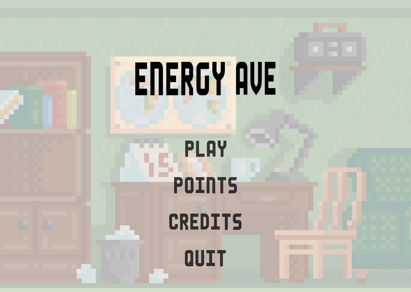
Players navigate a virtual home (bedroom, bathroom, kitchen) clicking on items in each space.
Tap household appliances and electronics to identify and correct energy-wasting behaviors.
Each interaction triggers a real-world energy fact card. Earn points, fill the meter, unlock the next room.
02. Research Goals & Questions
| Research Question | Research Goal |
|---|---|
| RQ1. What patterns in existing sustainability games drive or kill engagement? | Understand what makes existing sustainability games succeed or fail at engaging users. |
| RQ2. Which concept best meets the needs of our target users and client? | Identify which concept best balances educational impact, usability, feasibility and engagement. |
| RQ3. Can users understand how to play without a tutorial? | Validate whether the interaction model is intuitive without explicit instruction. |
| RQ4. Does the game motivate players to apply energy-saving habits in real life? | Evaluate whether the game teaches, engages and motivates real-world behavior change. Note: real-world behavior change wasn't directly measurable within the project timeline. A longitudinal follow-up remains the open question. |
Success Metrics: Defined Upfront
| Metric | Method | Target |
|---|---|---|
| User Engagement | Session Timing | ≥ 10 min/session |
| Task Success Rate | Usability Testing | ≥ 85% |
| Knowledge Improvement | Pre/Post Survey | ≥ 75% of users improve |
| Development Feasibility | Timeline Tracking | ≤ 3 months |
| Device Accessibility | Technical Testing | Mobile & desktop |
03. Stakeholder Interviews
- PlanetFlip Founder: past concepts were designed but never shipped.
- SD Climate Collaborative: surfaced a workplace training use case.
- NPS / Cabrillo: validated the public-institution use case.
Concept Feedback
| Category | What Stakeholders Said |
|---|---|
| Liked | Life-sim aesthetic, real-world integration. "Cozy" feel similar to Animal Crossing and Stardew Valley. |
| Wished | More critical thinking, community-building and customization options. |
04. Choosing a Concept
Weighted Decision Matrix
| Criteria | Weight | Energy Ave | Ocean Cleanup | Waste Mgmt | Trash Dash |
|---|---|---|---|---|---|
| Functionality | 3 | 0 | 0 | 0 | 0 |
| Usability | 4 | 0 | 0 | −1 | 0 |
| Desirability | 2 | 0 | −1 | 0 | −1 |
| Feasibility | 4 | 0 | −1 | 0 | +1 |
| Ecological-Sustainability | 1 | 0 | 0 | +1 | −1 |
| Weighted Total | n/a | 0 | −6 | −3 | +1 |
Scores are relative to Energy Ave (baseline = 0). Trash Dash's +1 edge came entirely from Feasibility (w=4): a 60-second mini-game is easier to build. Energy Ave matched or beat it on every other criterion, including Usability (w=4) and Desirability (w=2), which stakeholder feedback had flagged as primary.
05. Study 1 · Formative Testing
Method

A clickability/affordance test (what looks interactive?) plus a cognitive walkthrough of static wireframes (can users reconstruct the logic unaided?). Catching affordance problems pre-build is far cheaper than post-build. We validated the core interaction model before committing any engineering time.
Participants (n=3)
Two UCSD seniors and one 13-year-old 8th grader.
Part 1. Affordance Test Results
Participants circled elements they believed were interactive (n=3, cognitive walkthrough framing, not quantitative).
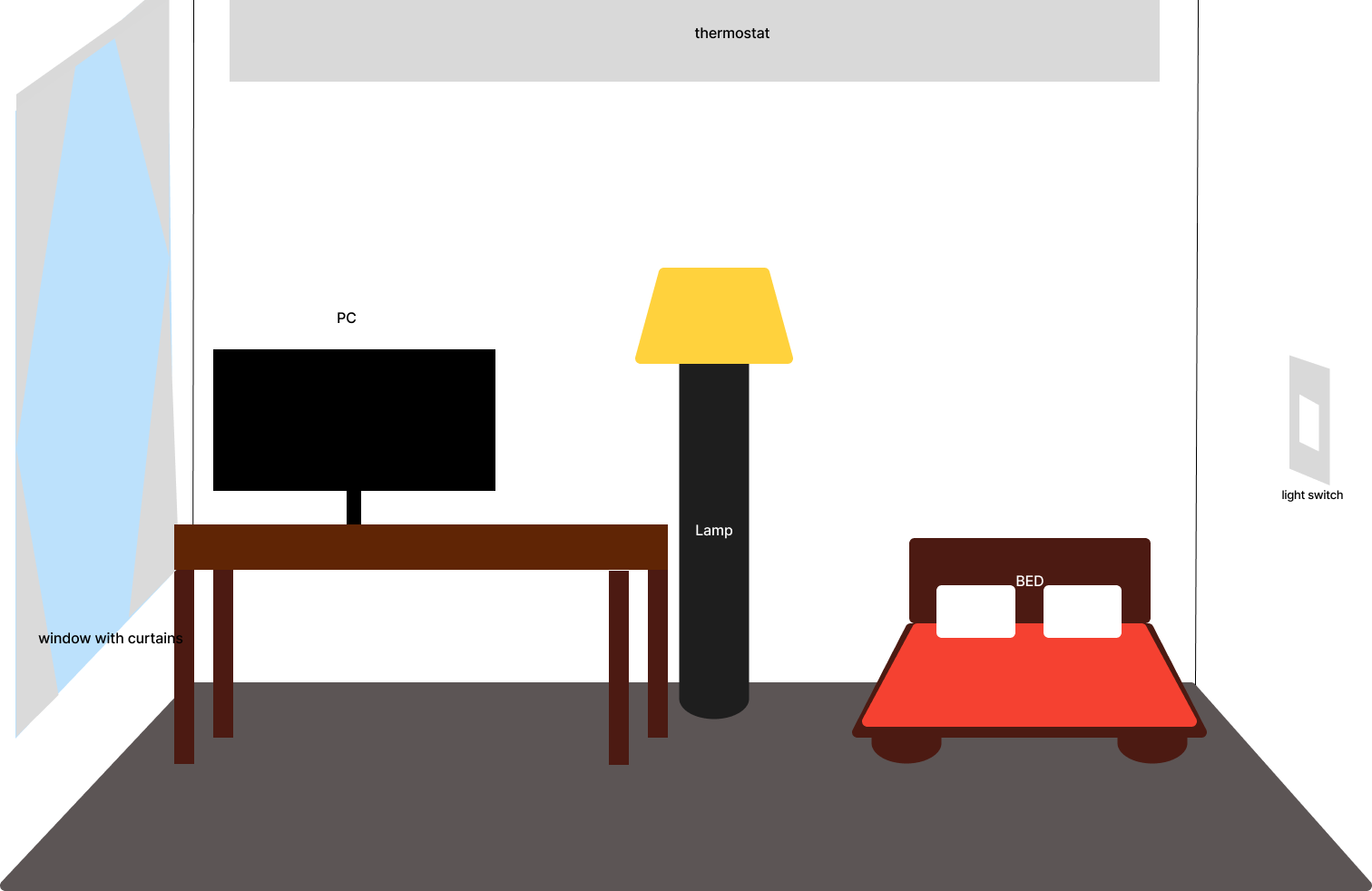
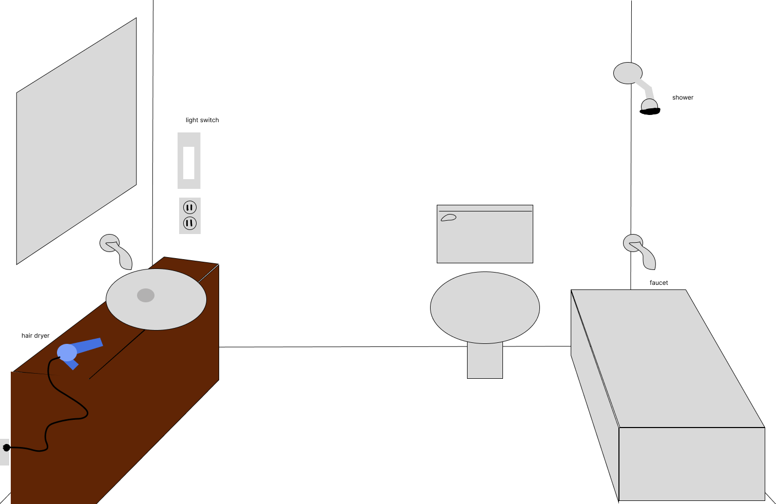
- PC / Laptop
- Lamp
- Light switches
- Blow dryer
- Outlet
- Thermostat
- Window
- Sink
- Shower faucet
- Bed
- Toilet
Part 2. Cognitive Walkthrough
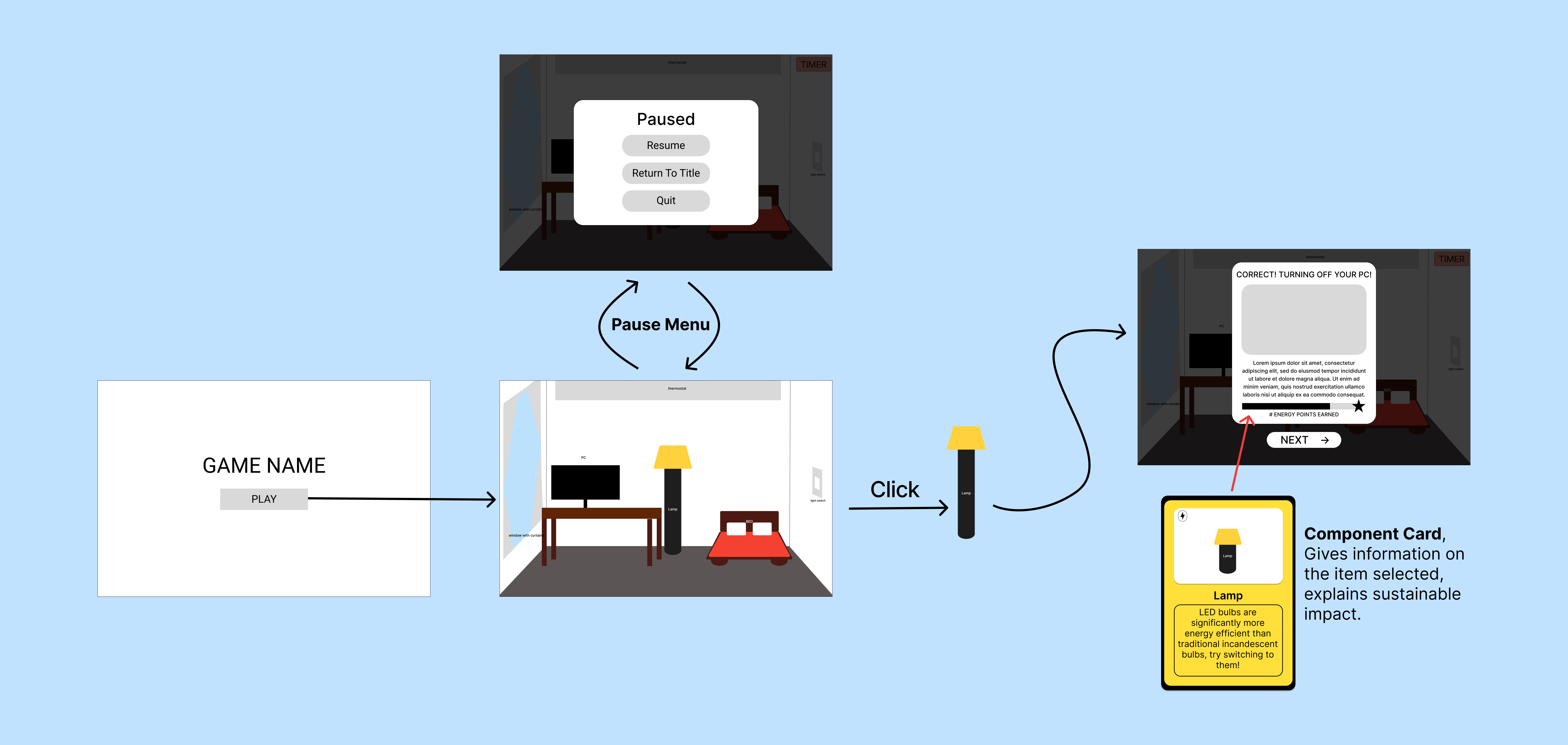
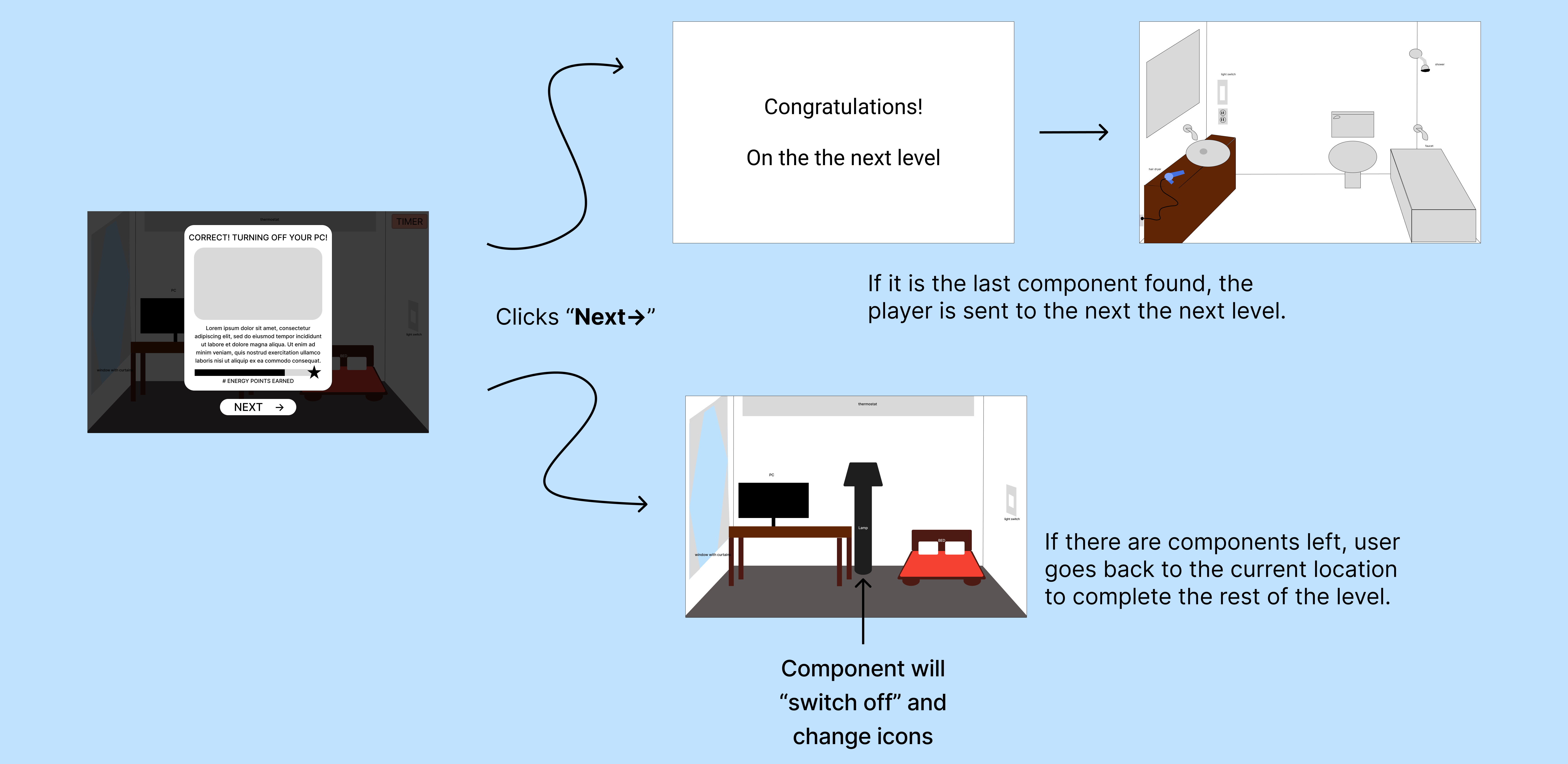
All three participants reconstructed the game's logic without instruction. Cody moved through the flow fluently; Paul had a self-correcting "aha moment" that actually confirmed the game's internal logic: only electricity-conducting items should be clickable. Preesha, the closest to the target age group, read it as a "storyline through a household," correctly predicted the pop-ups and praised the 8-bit aesthetic unprompted.
- Increase visual affordance for thermostat & window: add glow or animation cue.
- Reduce visual weight of the bed: consistently selected as interactive despite being passive.
- Fix energy bar update logic (Preesha flagged it was not updating correctly).
- Implement the timer: pause button appeared non-functional to participants.
06. Study 2 · Summative Testing
Method
Participants played the full game, then took a 7-question post-task survey. Behavioral data + self-reported experience. Observation shows what users do; surveys show how they feel. For a voluntary, intrinsically motivated product, both matter.
Participants
Results vs. Success Metrics
Qualitative Themes
All seven praised the visuals and audio unprompted. Descriptors ranged from "cute" and "chill" to comparisons with early-2000s browser games. A real differentiator in a sterile category.
"Cute aesthetics... kinda like girl2games and barbie.com." (P4)
The clearest criticism: lack of challenge. Interactables were too easy to spot. The pattern was strong enough across participants to require a design iteration.
"This feels like it's aimed at elementary schoolers." (P1, stakeholder)
Points needed to be numerically visible and items needed to flash on click. The energy bar should reflect running total, not the increment just added: the most directly actionable feedback of the round.
"I wished the energy bar reflected the new value rather than how much it added." (P7)
Not immediately clear the back button was what added points to the score. Needed explicit UI surfacing before the next build iteration.
07. Synthesis & Key Insights
The interaction model works. The reward model doesn't, yet.
All three Study 1 participants reconstructed the game's logic without instruction. A pattern that held across every gaming experience level in Study 2. The internal logic proved intuitive: users correctly inferred that only electricity-conducting items were interactive. What failed was the emotional payoff. High completion rates didn't translate to felt motivation, and the feedback loop needed to be faster and more visible: a distinct design problem from clarity.
The aesthetic direction is a genuine competitive advantage.
Every participant praised the visuals and audio unprompted: unanimous across seven people in a category dominated by sterile educational tools. Comparisons came up organically: Stardew Valley, Unpacking, Barbie.com. That kind of unsolicited reference signals genuine differentiation, not just polish, and is worth protecting in every future iteration.
The target audience wasn't fully represented in testing.
Both rounds skewed to UCSD undergraduates: only Preesha, 13, was near the actual target demographic. I identified this as a structural gap in the study design: a dedicated round with 8–12 year olds would likely surface friction around reading level, attention span and comprehension that the current data simply can't address.
08. Impact on Design
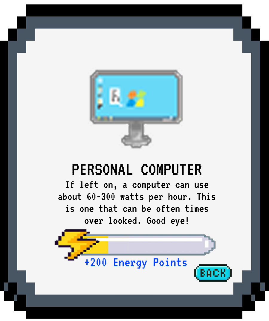
- 1Point VisibilityPoint values made numerically visible on each interaction card.
- 2Click AnimationItems flash visually on click to confirm the interaction registered.
- 3Audio FeedbackSound cues added to item interactions for tactile feel.
- 4Energy Bar FixEnergy bar updated to show running total, not just points just added.
- 5Back Button ClarityBack button behavior made more visually explicit in the UI.

Broader Outcomes
09. Reflection
What Went Well
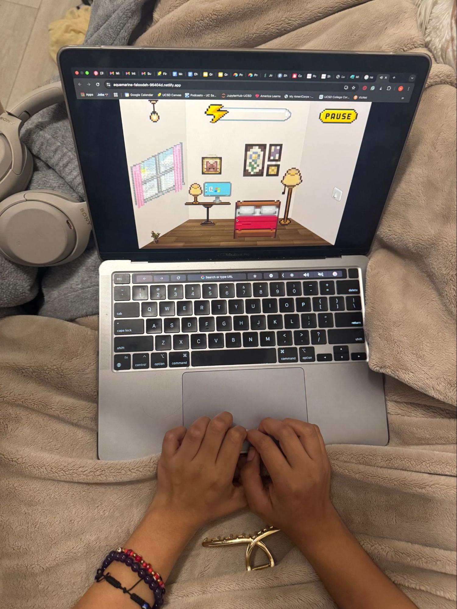
The two-study structure was the most valuable methodological choice. Splitting formative (wireframes) from summative (build) caught affordance problems before they were built in.
Mixed methods (observation + survey) gave a richer picture than either alone. The gap between completion and satisfaction was where the most interesting design work lived.
What I'd Do Differently
The biggest gap was participant representation: both studies skewed to UCSD undergrads. A study with 8–12 year olds would've surfaced different friction: reading level, attention span, comprehension.
I'd also push for a longitudinal component: a follow-up 1–2 weeks post-play to measure whether energy-saving behaviors stuck at home. The more important, still-unanswered question.
What I'm Taking Forward
This project sharpened my ability to design studies that constrain scope without sacrificing signal, and to write findings that actually change what gets built, not just what gets documented.
End of case study · Energy Ave / PlanetFlip · 2025